UniAcco PDP, rebuilt
Students were making a high-consideration housing decision on pages that buried key information, fragmented trust signals, and offered unclear next steps. I revamped how students interacted with the page: restructuring information, surfacing decision-critical content, and creating a clearer path from evaluation to enquiry.
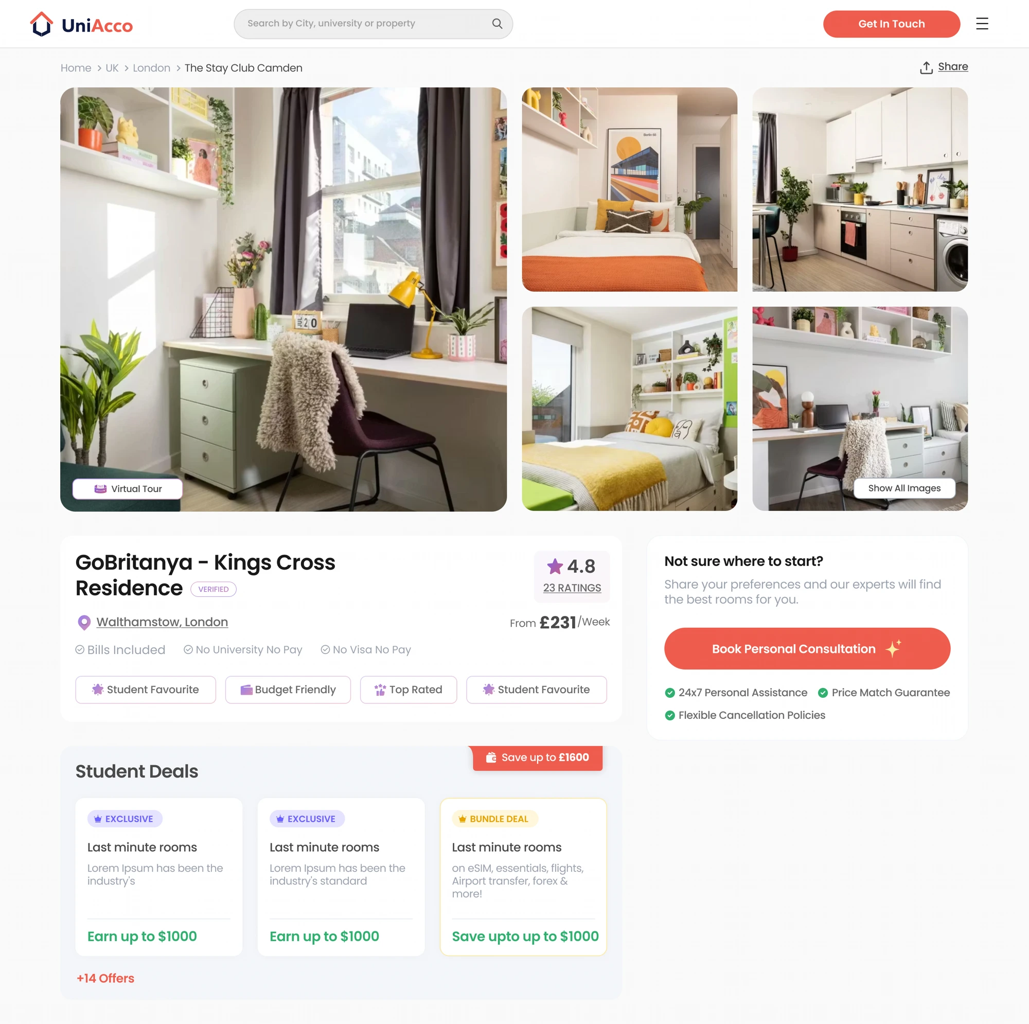
What was actually broken.
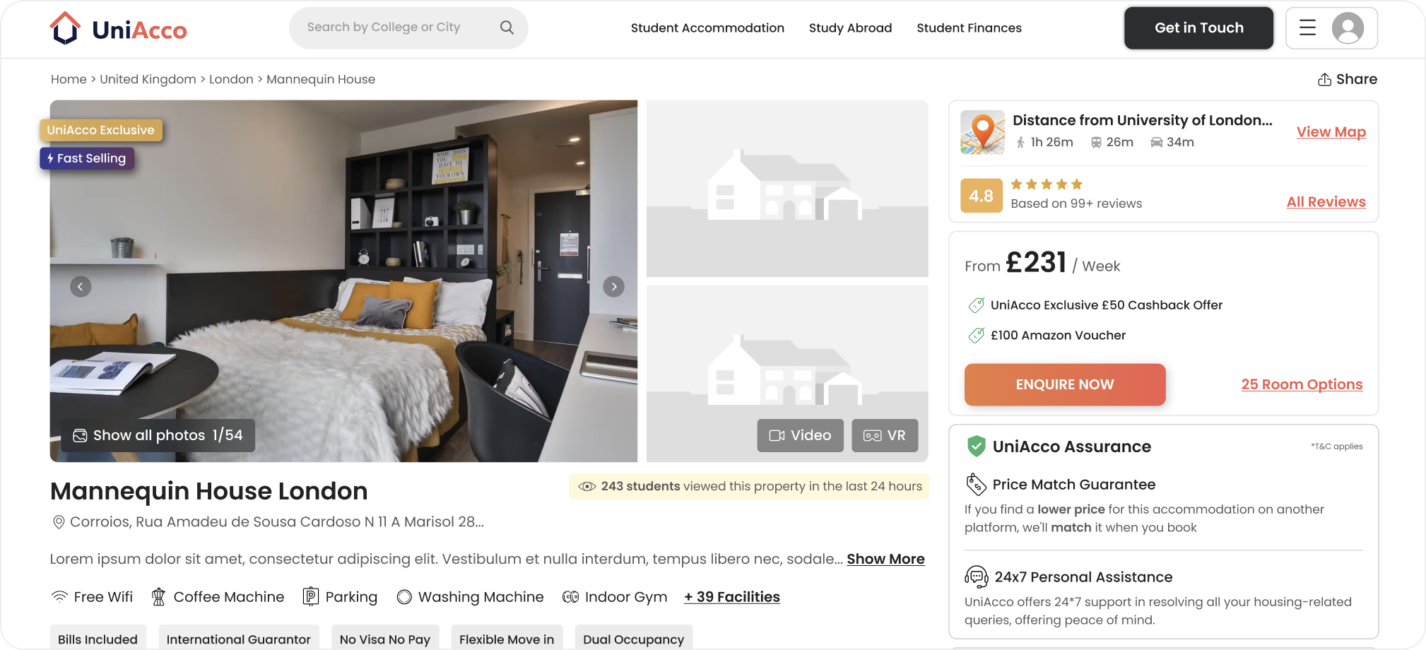
- 01Close to zero organic traffic: property pages contributed a rounding-error share of sessions while UHomes ran on 64% organic. UniAcco pulled ~872K visits vs Amber's 2.64M.
- 02Worst engagement in the competitive set: 48% bounce (peers 39–45%), 1m52s visit duration (peers up to 3m08s), 2.72 pages per visit (Amber: 3.68).
- 0314 collapsed policy accordions occupied more page real estate than photos, reviews and location combined: a 39-item facility checklist, dense room-tenancy matrix, unformatted legalese.
- 04Three conversion surfaces fighting on one screen: price card, full lead form, and 'Book Now' buttons on every table row, with no hierarchy between self-serve and assisted paths.
- 05A link farm above the footer: hundreds of undifferentiated text links diluted page authority instead of distributing it, with near-zero user clicks.
How I got it unstuck.
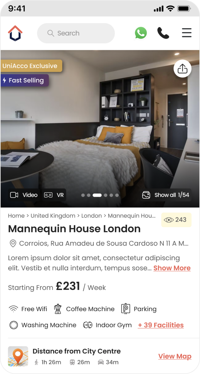
A single conversion system with two honest intents, self-serve 'Reserve now' and assisted 'Take expert help', replaces three competing widgets. Sticky CTA on mobile echoes the same hierarchy.
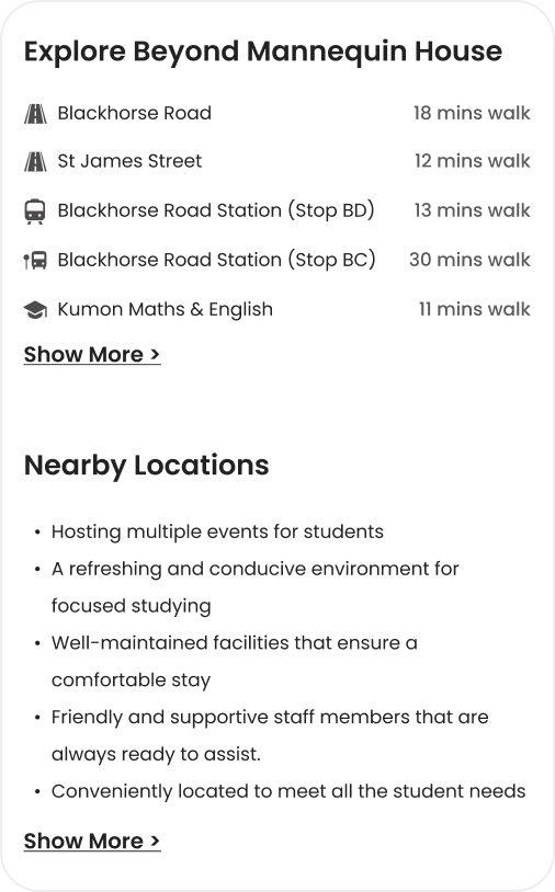
Every data dump becomes a designed object. 39-item checklists become icon summaries grouped by intent. Table rows become room cards with photos. Text bullets become mapped, categorised places with walk times.
Page section order mirrors the student's decision journey: see it, trust it, price it, understand terms, act. That same spine gives crawlers a clean semantic outline: one idea per section, one heading per idea.
Each section ends with a reason to continue. Engagement time isn't vanity, it's a ranking signal the page is deliberately designed to earn.
The moves that did the work.
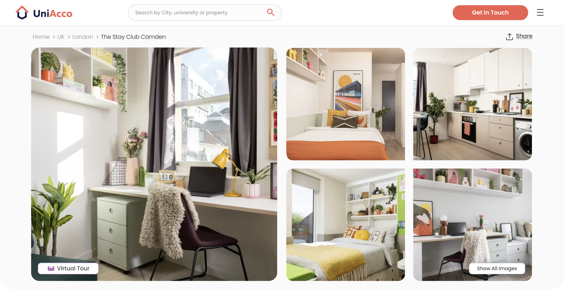
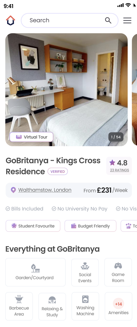
A 1+4 grid surfaces five real photos on load, with Virtual Tour promoted onto the hero image and "Show All Images" replacing the old "1/54" counter.
Why: The old hero buried the gallery behind one photo and two placeholder thumbnails, leaving most of the 54 images unseen. Heatmaps showed people clicking those thumbnails anyway, the demand to browse was already there, just unsurfaced.
Rating and trust now sit beside the property name: ★4.8 · 23 ratings · Verified, where a plain view-count badge used to be. The address shortens into a clickable line, SEO copy moves down out of the hero, and amenity icons are replaced by anxiety-specific tags (Bills Included, No University No Pay, No Visa No Pay).
Why: The first five seconds decide trust for a student booking sight-unseen abroad. Moving credibility signals into the space that used to hold a view counter and full address puts proof where eyes land first, without deleting the SEO text, just deprioritising it.
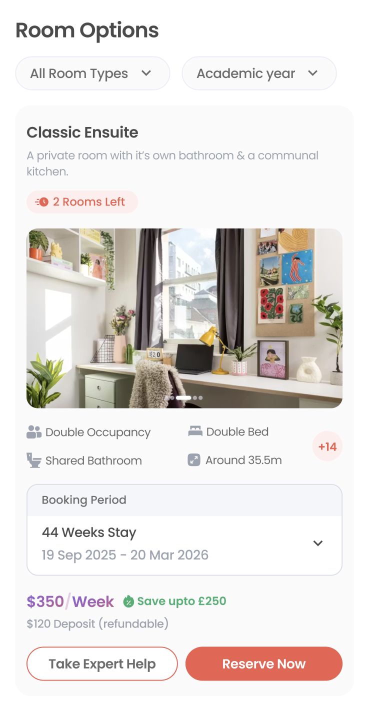
One card per room: photo, name, a scarcity flag ("2 Rooms Left"), and the four specs students weigh, up front. Per-duration rows collapse into a single "Booking Period" dropdown, with price and savings sitting above two clear actions, Take Expert Help and Reserve Now.
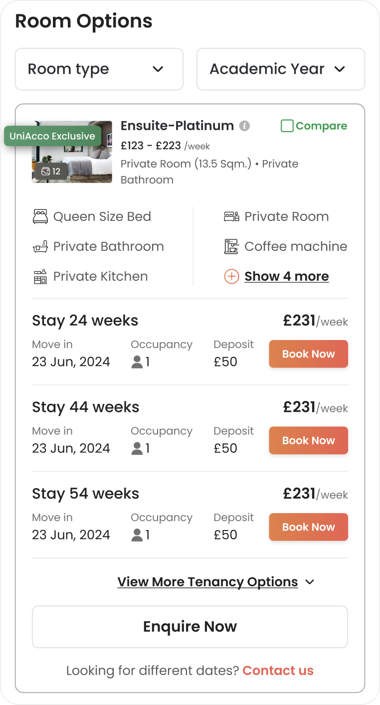
Why: The old matrix repeated the same price across three duration rows, each with its own Book Now button, comparing rows, not rooms. One dropdown and two honest CTAs turn a spreadsheet into a single decision.
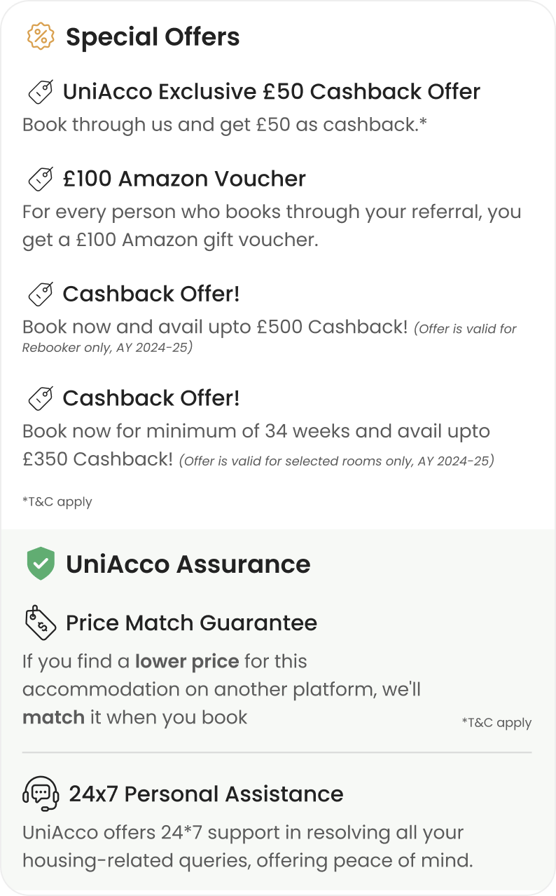
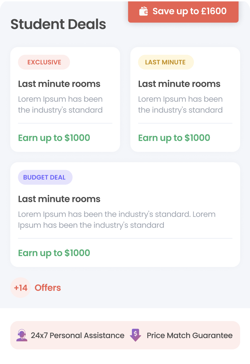
Four cashback offers and two assurance items, once stacked as paragraphs with fine print, become tagged "Student Deals" cards (Exclusive, Last Minute, Budget Deal), each headlined with one number, "Earn up to $1000," under a single "Save up to $1600" badge. Assurance content collapses into a small tag strip (24x7 Personal Assistance, Price Match Guarantee) instead of its own paragraph block.
Why: Four offers buried in fine print gave no sense of value or relevance at a glance. One number per labeled card makes value scannable; guarantees move from an essay to two tags without losing the reassurance.
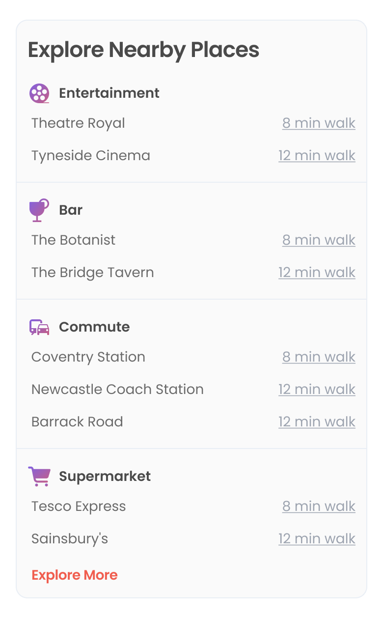
"Explore Nearby Places" now groups results under labeled categories: Entertainment, Bar, Commute, Supermarket, each with a named place and walk time, replacing one flat list mixed with generic marketing bullets.
Why: The old module read like copywriting with a few walk-times attached, with no way to tell a supermarket from a train stop at a glance. Categorising by the question a student is actually asking turns a list into a decision aid.
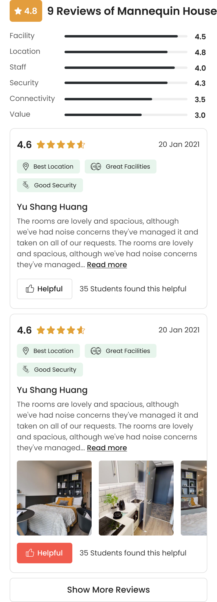
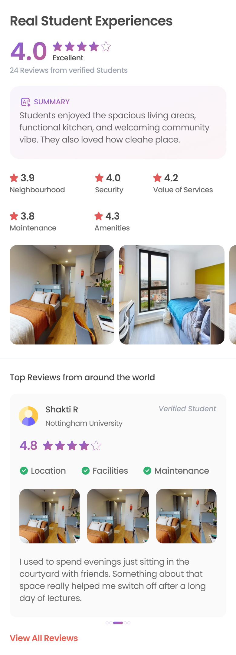
The section now opens with a "4.0 Excellent" score and an AI-written summary card, then category ratings and a photo strip, before named, verified student reviews carrying category tags, replacing the old bar-chart-plus-comment-list format.
Why: The old reviews were functional but read as a wall of text. A scannable summary and score give skimmers the verdict instantly, while verified reviews underneath keep the evidence intact for anyone who wants it.
These are conversion outcomes. The structural SEO work is unproven: the page launched in May, organic compounds over quarters, and I don't have post-launch ranking data. I'd call that half sound in principle and unmeasured.
“SEO is an information-architecture problem before it's a keyword problem. We never 'optimised copy'; we gave the page a spine that matched how students decide, and rankings followed the structure. Design owned the outcome, not just the surface.”
Deleting is a design decision. The price-trend chart, the urgency counter, eleven policy accordions, the link farm: some of the highest-impact moves were removals. Attention data made those cuts defensible.
Design the measurement with the page. Defining per-section engagement events with the PM before build meant that at launch we could attribute movement to specific decisions, turning the next roadmap debate into a data conversation, not an opinion contest.
Time on page is a means, not an end. Session duration dipped slightly YoY while conversion jumped: students stopped spending time searching and started spending it deciding. Treated as a goal, that's a regression; treated as a signal, it's the redesign working.